
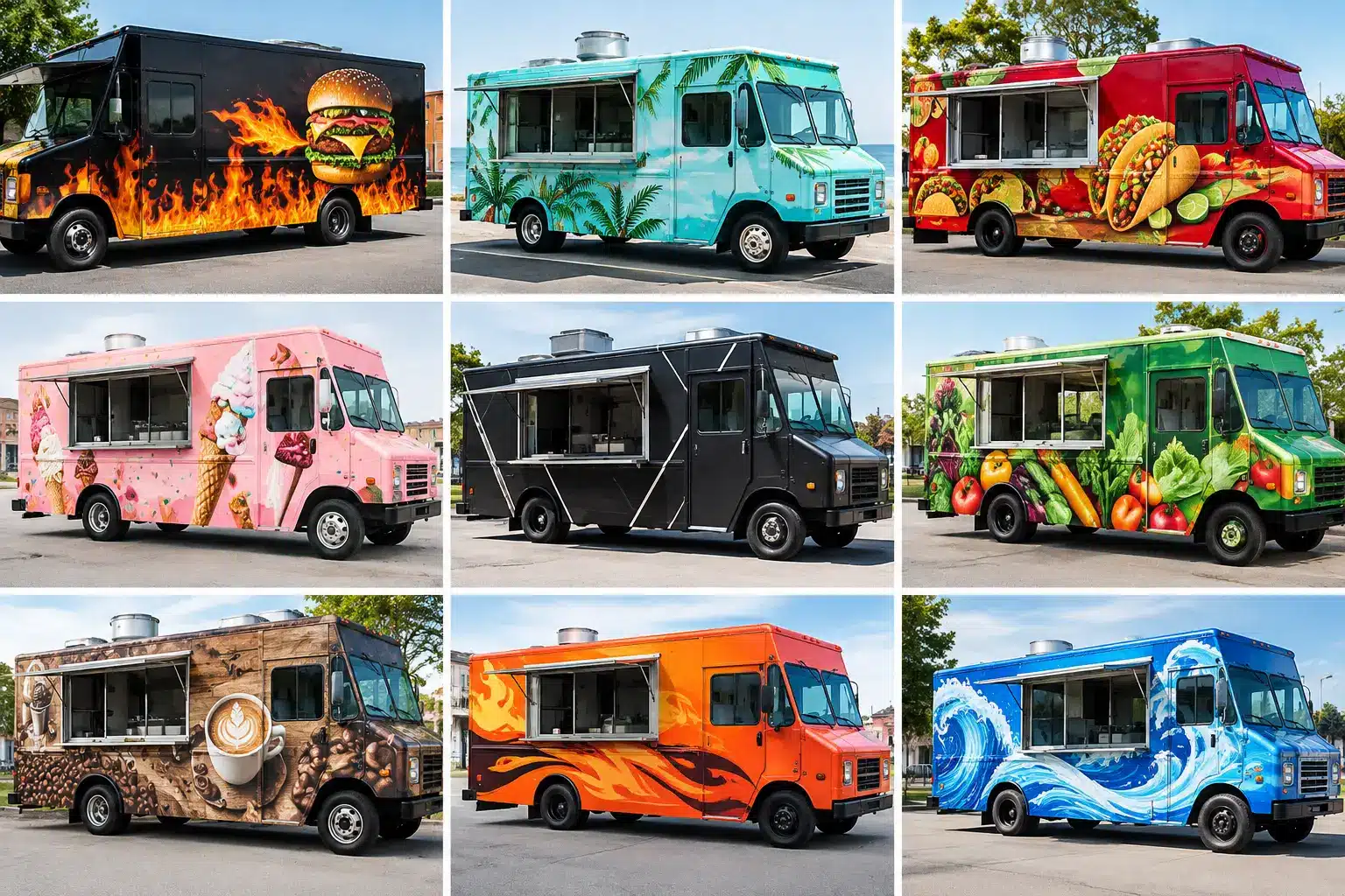
A food truck has seconds to earn attention at a brewery, office park, festival, or busy Charleston street corner. The best food truck wrap themes do more than make the truck look good. They tell people what you serve, set an expectation for the experience, and make your name easier to remember when hunger strikes later.
The right theme turns your truck into a moving storefront that works between events, during prep runs, and while parked at its regular lunch stop. A great wrap should be big, clear, appetizing, and unmistakably yours from across a parking lot.
What the Best Food Truck Wrap Themes Have in Common
A strong food truck wrap starts with a business decision, not a favorite color. Your design needs to match the food, the price point, the crowd, and the places where you sell. A late-night smashburger concept can carry a louder, more playful look than a premium seafood truck catering weddings and corporate events.
Clarity comes first. People should be able to spot your business name, understand the food category, and find the ordering window without standing directly beside the truck. Use high-contrast color, readable type, and a limited number of dominant visuals. A wrap crowded with every menu item, social handle, award, and slogan can become invisible at driving speed.
It also pays to design for photos. Customers regularly post food truck finds, especially at local events. A memorable side panel, a clever line near the service window, or a branded photo moment can give guests a reason to share your truck before the first bite.
12 Themes That Make Food Trucks Hard to Miss
1. The Hero Food Close-Up
For a concept with one visual star, put it front and center. An oversized burger with melting cheese, a stacked taco, a glossy lobster roll, or a swirl of soft serve can communicate the menu faster than a paragraph ever could. Keep the photography or illustration sharp and the background simple, so the food remains the focal point.
This is a high-impact choice for trucks with a narrow menu or one signature item. It is less effective if you sell several unrelated cuisines, since one food image may create the wrong expectation.
2. Lowcountry Coastal Flavor
Charleston food businesses have a natural visual advantage. Oyster shells, tidal blues, marsh grass, shrimp boats, palmetto silhouettes, and subtle nautical striping can create a coastal theme without making the truck look like a souvenir shop.
This approach works especially well for seafood, fish tacos, coastal bowls, frozen treats, and Southern-inspired menus. The key is restraint. Pair one or two regional cues with a modern logo and clean typography to keep the design premium.
3. Bold Street-Art Energy
Murals, hand-painted lettering, bright blocks of color, and playful illustration create instant festival appeal. This theme is a strong fit for tacos, wings, loaded fries, global street food, and late-night concepts that want a younger, social crowd.
Street-art graphics need disciplined execution. High energy does not mean visual chaos. Build the design around a clear logo, two or three core colors, and a recognizable pattern that can appear on the truck, packaging, staff shirts, and event signage.
4. Vintage Diner Americana
Checkerboard accents, retro script, chrome-inspired type, and classic red, cream, or turquoise palettes make familiar comfort food feel intentional. This theme is built for burgers, hot dogs, milkshakes, barbecue, and breakfast sandwiches.
A vintage look can build instant warmth, but it should still feel fresh. Avoid loading every panel with retro icons. One strong visual system will feel more authentic than a collage of old-fashioned details.
5. Southern Smokehouse
Deep charcoal, weathered wood textures, warm orange accents, and bold block lettering give barbecue and smoked-meat trucks a grounded, confident presence. This is not a theme that needs to shout. It needs to make customers think of slow smoke, serious flavor, and a full plate.
Use food imagery selectively. A close-up of bark-covered brisket or ribs can work beautifully, while too many flames, pigs, and smoke effects can push the look into cliché territory. Let your pitmaster story and signature cuts do the heavy lifting.
6. Clean Modern Minimalism
A crisp background, a bold logo, one graphic element, and strategic color can make a food truck stand out precisely because it is not noisy. This is an excellent direction for coffee, acai bowls, salads, gourmet sandwiches, vegan food, and chef-driven concepts.
Minimalism has a trade-off: every design choice is highly visible. Weak typography, generic icons, or poor color contrast cannot hide behind decoration. When done well, though, this style can make a small menu feel polished and a higher price point feel justified.
7. Hand-Drawn Neighborhood Charm
Custom illustrations, hand-lettered names, and friendly characters make a truck feel personal before customers reach the line. This style is ideal for bakeries, coffee carts, ice cream, family-run concepts, and brands that want to feel rooted in a particular neighborhood.
A hand-drawn theme can also tell a story. Maybe the artwork reflects a family recipe, a local landmark, or the ingredients behind your specialty. The result is more memorable than stock graphics because it gives people something real to connect with.
8. Tropical Escape
Bright citrus colors, palm leaves, sun-washed gradients, and playful fruit illustrations bring a vacation mood to smoothies, poke bowls, frozen drinks, Caribbean food, and shaved ice. This look performs well at beach-adjacent events and warm-weather festivals.
Make sure the tropical theme supports your actual menu. If the food is refined or upscale, choose a cleaner palette and stylized botanical elements instead of loud cartoon imagery. The visual promise should match the plate.
9. Industrial Urban Kitchen
Matte black, steel gray, concrete textures, strong sans-serif type, and selective neon color create an edge for pizza, grilled cheese, ramen, burgers, and chef-led comfort food. It has a confident, after-dark feel that works well near breweries and music venues.
The practical challenge is legibility. Dark trucks can look powerful, but black-on-gray text disappears quickly at night. Use light lettering, reflective accents where appropriate, and clear lighting around your ordering area.
10. Farm-Fresh Market Style
Natural greens, produce illustrations, kraft-paper tones, and simple ingredient callouts communicate freshness and care. This theme suits seasonal menus, vegetarian concepts, farm-to-table bowls, fresh juices, and local-produce businesses.
Do not let “natural” become dull. A bright pepper red, sunny yellow, or vivid herb green gives the wrap enough energy to perform in traffic. The goal is wholesome and vibrant, not muted and forgettable.
11. Local Landmark Pride
A food truck can build recognition by weaving in a subtle sense of place. Charleston architecture, a recognizable bridge line, neighborhood references, or a regional phrase can help customers feel that the business belongs here.
Use this theme carefully if you plan to travel widely for catering or events. Local pride is powerful, but the primary message still needs to be your name and food. A visitor should understand what you serve even if they do not recognize the landmark.
12. Signature Mascot or Character
A great mascot can turn a truck into a local favorite. Think of a lively shrimp, a confident chicken, a cheerful dumpling, or a character based on the owner’s story. A mascot gives you an easy visual language for menus, stickers, event banners, and social content.
The character needs to fit your brand personality. It can be funny, polished, spicy, or slightly mischievous, but it should not overpower the food. The best mascots make customers smile and still leave them craving the menu.
Build the Theme Around Real-World Selling
Before approving a design, picture the truck in its actual environments. Will customers see it from a road, from a crowded event line, or from a distance across a brewery lawn? Will the service window cut through a key graphic? Does the truck need room for changing specials, QR codes, sponsor logos, or catering information?
A full wrap can carry a complete visual experience, while partial wraps and spot graphics can deliver strong branding on a tighter budget. The right scope depends on your truck, launch plan, and how much of the vehicle is visible when parked. Whatever direction you choose, do not treat the driver and passenger sides as identical billboards. The service side should guide ordering. The street-facing side should earn attention first.
Charleston Wraps designs food truck graphics around the vehicle itself, including panel breaks, windows, doors, vents, and the way customers approach the truck. That planning helps the final installation look intentional instead of forcing a flat design onto a complicated surface.
Your theme should make one promise at a glance: this is who we are, this is what we serve, and this is why you should walk over. Start there, then let every color, image, and word earn its space.