
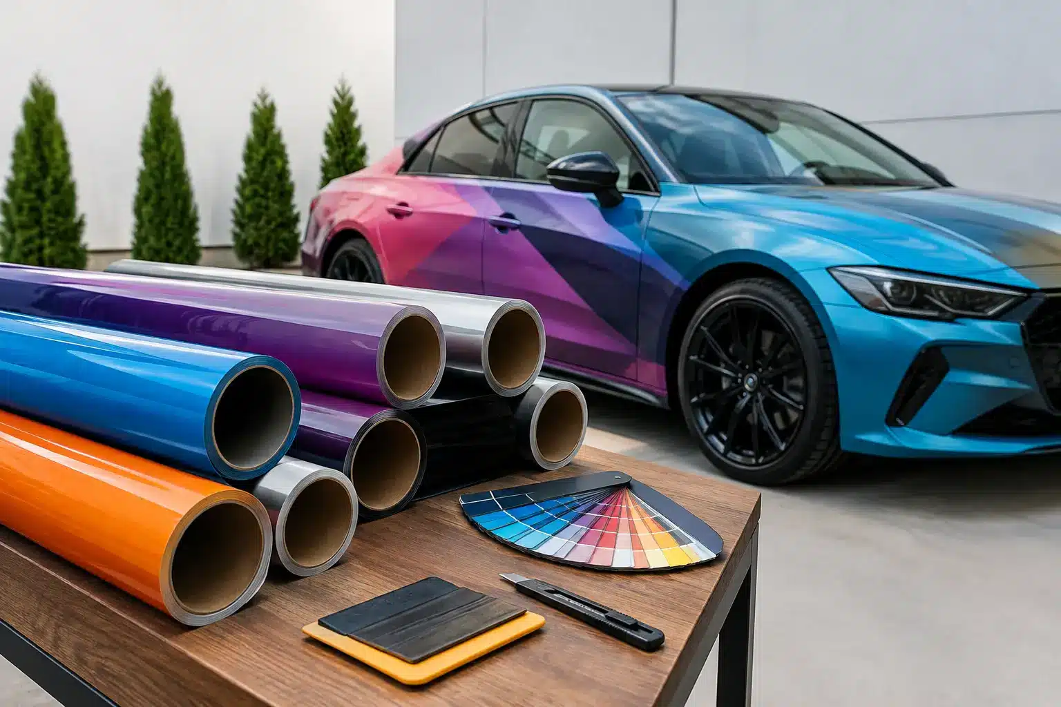
A wrap gets only a few seconds to make its point at a Charleston stoplight, in a marina, or across a packed event floor. The best vinyl wrap design is not the one with the most graphics. It is the one people can recognize, understand, and remember before the vehicle turns the corner. This vinyl wrap design guide will help you build a look that performs in the real world, whether you are branding a work truck, changing your car’s color, refreshing a boat, or planning a statement-making dance floor.
Start With the Job Your Wrap Needs to Do
Every successful project begins with one clear purpose. A commercial van has a different job than a personal truck. A boat’s side graphics have different viewing conditions than a retail wall, and a wedding dance floor needs to look exceptional in photos as well as in the room.
For a business vehicle, the priority is fast recognition. Your company name, primary service, phone number or website, and visual identity should work together at a glance. A well-designed commercial wrap can put your brand in front of an estimated 30,000 to 70,000 people each day, depending on where and how often the vehicle travels. That is a lot of visibility, but only if the message is readable.
For a personal color change or custom design, the goal may be more expressive. Matte black, satin metallic, racing-inspired graphics, a chrome delete, or a fully custom print can make a vehicle feel entirely new without a permanent paint job. In that case, the design should reflect the owner’s style while working with the vehicle’s body lines.
Before design begins, decide what one reaction you want from the viewer. It might be “I know who to call,” “that boat looks incredible,” or “this event feels like us.” That decision keeps the concept focused.
Vinyl Wrap Design Guide: Build for Distance First
A wrap is rarely viewed from six inches away. Most people see it from a sidewalk, another lane of traffic, or across a parking lot. Design for those conditions first, then add the details that reward a closer look.
Make the Main Message Easy to Read
For commercial wraps, prioritize information in this order: company name, what you do, and how to reach you. Trying to give every service equal size usually creates a crowded layout. A contractor may offer roofing, siding, gutters, repairs, and inspections, but “Roofing and Exterior Services” may communicate more effectively than five separate lines of copy.
Use a typeface with strong letterforms and enough contrast against the background. Thin script can be beautiful on a boutique trailer or wedding floor, but it may disappear on a moving box truck. If a word cannot be read from several car lengths away, it is decoration, not advertising.
Large logos and short service descriptions tend to outperform dense paragraphs. Your wrap should start the conversation, not try to close the entire sale in traffic.
Use Contrast Like a Marketing Tool
High contrast is what makes a message survive glare, shadows, rain, and motion. Light lettering on a dark field, dark lettering on a light field, and purposeful color blocking all help the key elements stand apart.
Brand colors still matter, but they may need adjustment for a wrap. A pale yellow logo can look great on a screen and vanish against a white vehicle. A designer can preserve the spirit of the brand while giving it the contrast needed for the road.
Photography and textured backgrounds can add depth, especially for food trucks, retail graphics, and specialty trailers. The trade-off is legibility. Keep busy imagery away from phone numbers, service descriptions, and other must-read areas.
Let the Surface Lead the Layout
Vehicles are not flat billboards. Doors open, handles interrupt artwork, wheel wells cut through lower graphics, and body curves can stretch a design in unexpected ways. Boats have rails, rub lines, vents, and changing panel shapes. Dance floors may have seams, edges, and a viewing angle that changes the moment guests step onto them.
A strong concept accounts for the actual surface from the start. This is why accurate vehicle year, make, model, body style, and dimensions matter. For trailers, box trucks, food trucks, boats, and event floors, measurements and photos give the design team the information needed to place graphics where they will look intentional.
Do not force a logo into a door seam simply because it is centered on a digital mockup. Sometimes shifting an element slightly creates a far better finished result.
Choose a Wrap Scope That Matches the Goal
Not every project needs a full wrap. The right coverage depends on visibility goals, budget, the condition of the surface, and the look you want.
A full vehicle wrap creates the biggest transformation and gives businesses the most usable advertising space. It is ideal when you want a complete color change, a strong branded presence, or a design that flows around the entire vehicle. Partial wraps use existing paint as part of the composition, which can be a smart option when the vehicle color supports your brand palette. Spot graphics, door logos, lettering, and decals provide a clean, economical branding solution for fleets that need consistency without full coverage.
The same thinking applies to boats. A full marine wrap can completely change the profile of a vessel, while a boat name, transom graphic, or side lettering may be all it takes to make it feel personal. For retail spaces, one feature wall, window graphic, or branded counter can make a stronger impression than covering every available surface.
A good design does not apologize for its scope. It makes the chosen coverage look deliberate.
Match the Design to the Vehicle’s Personality
A design that looks sharp on a Sprinter van may feel out of place on a pickup or enclosed trailer. Think about the vehicle as part of the brand experience.
Trades and service vehicles often benefit from confident layouts, bold color fields, and large contact details. Fleet vehicles need a repeatable system that looks consistent across different models. Food trucks can carry more personality, using illustrated ingredients, menu-inspired colors, and memorable brand characters, as long as ordering information remains clear.
Personal vehicles offer more room to play. Gloss finishes can create a deep, paint-like appearance. Satin and matte finishes bring a modern, understated look. Color-shifting films, carbon-fiber textures, printed graphics, and accent stripes can make a daily driver feel one of a kind. The smartest choice depends on whether you want subtle sophistication, all-out attention, or a balance of both.
For boats, consider where they live. Bright colors and crisp lettering can pop on the water, while a design with too many small details may get lost at dockside distance. Marine graphics also need to complement the vessel’s lines rather than fight them.
Do Not Treat the Back as an Afterthought
The rear of a work vehicle is often the closest view drivers get while stopped in traffic. It is prime real estate for a memorable logo, a direct service message, and an easy next step.
Keep rear messaging simple. A large company name, phone number, web address, or short line such as “Charleston’s Exterior Experts” gives people something they can absorb quickly. QR codes can be useful in the right setting, but they should not be the only way to contact you. Nobody should need to scan a code while driving to understand who you are.
The back is also a chance to carry the design through the vehicle. When the rear feels disconnected from the sides, even a high-quality installation can look unfinished.
Plan for Real-World Use and Long-Term Appearance
Great wrap design includes practical choices. Dark colors can show dust and water spots more readily than lighter finishes. Highly detailed printed graphics may demand more careful cleaning to stay crisp. A fleet vehicle that spends its day on job sites may need a different strategy than a weekend show car.
Paint condition matters, too. Vinyl adheres best to stable, well-maintained surfaces. Existing peeling paint, corrosion, deep damage, or failing clear coat should be addressed before installation. A wrap can protect factory paint from everyday road debris and minor scratches, but it cannot repair a compromised surface underneath.
Think through the life of the design. If your company expects to add services, open a second location, or update its phone number soon, build flexibility into the layout. If you are wrapping a leased vehicle, choose coverage with eventual removal in mind. If paint protection is the priority, paint protection film may be a better fit than a graphic wrap for high-impact areas.
Bring the Right Information to the Design Process
The fastest path to a better wrap is a clear project brief. Share the exact vehicle or boat details, current photos, logo files, brand colors, preferred design direction, and any non-negotiable information. For businesses, explain your service area and the customers you want to attract. For event projects, provide floor dimensions, venue requirements, color palette, and the date the space must be ready.
It also helps to say what you do not want. Maybe you want no cartoon imagery, no camouflage, no oversized phone number, or no glossy finish. Honest preferences save time and help turn a broad idea into a design that feels like it belongs to you.
Charleston Wraps approaches every project around the actual application, because a van, center-console boat, storefront, and dance floor all demand different design decisions. The more specific the starting details, the more confidently the final graphics can be built.
Your wrap does not need to say everything. It needs to say the right thing clearly, look exceptional on the surface it lives on, and give people a reason to remember you after they have moved on.