
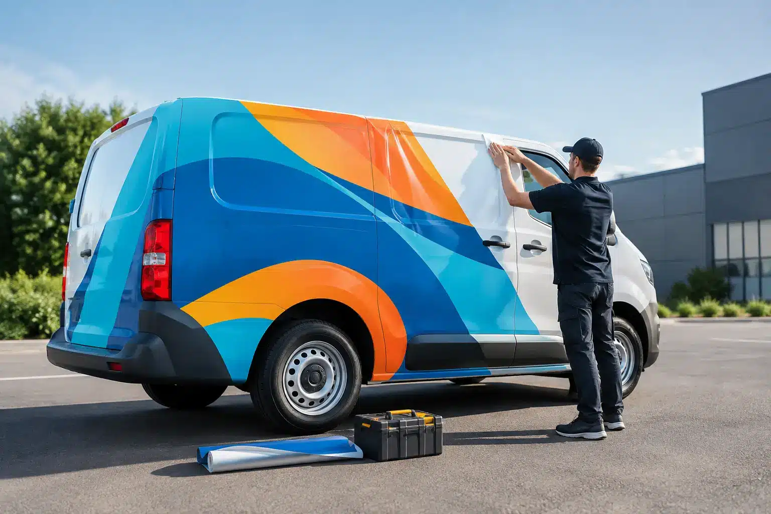
A white cargo van parked at a job site has a few seconds to answer the question every potential customer is asking: who does this work, and how do I reach them? That is the real starting point for how to design van graphics. Great van graphics do more than look sharp at pickup. They put your name, service, and contact details in front of local customers on every route, estimate, delivery, and service call.
For Charleston-area businesses, a van wrap can turn a vehicle you already need into an always-on advertising asset. The strongest designs are not the busiest. They are built for fast recognition from the street, the next lane, or a parking lot.
Start With the One Message You Need Drivers to Remember
Your van may have plenty of square footage, but it does not need to carry your entire company story. Someone passing your vehicle at 35 mph will not read a paragraph about your process. They should immediately understand your brand, your core service, and the next action to take.
For a plumbing company, that might be the company name, “Plumbing and Drain Service,” a phone number, and a memorable visual. For a caterer or food business, it may be the logo, cuisine category, service area, and appetizing product photography. A contractor may lead with the trade – roofing, HVAC, electrical, landscaping, or restoration – because that clarity drives calls.
Decide what must be seen first, second, and third. In most cases, the visual hierarchy should be your logo or company name first, your service second, and your phone number or website third. If your van design makes all three elements compete at the same size, none of them wins.
How to Design Van Graphics for Quick Reads
The side of a van is your main billboard. It is long, visible in traffic, and naturally suited to a simple left-to-right layout. Use the largest portion of that space for your brand name and primary service. Keep smaller supporting information toward the rear or lower sections, where it can reward people who are standing nearby without slowing down the main message.
The rear doors deserve special attention. Drivers behind you have more time to read them at lights and in traffic. This is a smart place for a large logo, phone number, website, QR code if it has a clear purpose, and a short call to action. Do not rely on a QR code alone. Many people will never scan it, but they may remember an easy phone number or recognizable business name.
The front of the van has less usable area, but it still matters for a polished fleet appearance. Door logos and a consistent color treatment can make the vehicle recognizable from every approach. If your company runs multiple vans, consistency is what makes one vehicle become a recognizable local fleet.
Build Around the Van, Not a Flat Template
A van is not a blank rectangle. Door seams, handles, fuel doors, windows, mirrors, body curves, sensors, and wheel wells all affect how a design reads once installed. A layout that looks clean on a computer can become awkward when a phone number runs through a door handle or a logo gets split across a seam.
This is why accurate vehicle measurements and templates matter. The make, model, year, roof height, wheelbase, window configuration, and condition of the vehicle all shape the design approach. A high-roof Sprinter gives you a very different canvas than a compact transit van, and a passenger van with side windows requires a different strategy than a solid-panel work van.
Keep critical text and logos away from breaks in the body whenever possible. Large background elements can flow across seams, but your most important words should stay intact. Design also needs to account for how vinyl stretches around recessed areas and curves. A professional installer can guide those decisions before production, protecting both the final look and the life of the wrap.
Use Color and Type That Work Outside
Your brand colors should stand out in real conditions, not just on a bright screen. Charleston sun, rain, shadows, road dust, and nighttime headlights can all change how graphics look. High contrast is usually your friend: dark lettering on a light background or light lettering on a dark background gives people a better chance of reading your message at a glance.
That does not mean every van needs to be loud. A clean black, white, and metallic design can look premium and professional. A bold color-blocked wrap can be ideal for a company that wants maximum recognition. The right direction depends on your existing brand, your customer base, and where the vehicle spends most of its time.
Choose typefaces for readability before personality. Script fonts and ultra-thin letters may look impressive in a logo, but they are often hard to read from a distance. Use clear, substantial lettering for services, phone numbers, and URLs. If your logo uses a decorative typeface, pair it with a simple supporting font rather than repeating the same style across every line.
Let Images Support the Service
Photography, textures, illustrations, and custom patterns can make van graphics memorable, especially for food trucks, pet services, home services, and consumer-facing brands. The key is using them with purpose. An image should reinforce what you do, not create visual noise.
A flooring company might use a rich wood or tile texture as a background accent. A seafood business may use water, coastal color, or ingredient imagery to create appetite and local character. A restoration company can use clean, confident graphics that signal order and reliability rather than a collage of disaster scenes.
Avoid low-resolution images and tiny photo details. Large-format printing exposes weak artwork quickly. A professional design process uses high-quality files and considers viewing distance, so the finished graphics look intentional up close and powerful from the road.
Match the Wrap Scope to Your Goal and Budget
A full van wrap delivers the biggest visual transformation. It can change the vehicle’s base color, create a complete branded environment, and maximize visibility from multiple angles. For companies making a major market push or building a recognizable fleet, full wraps are often the strongest choice.
That said, partial wraps can be highly effective when the design uses the vehicle’s existing paint color strategically. A bold partial wrap with large graphics can create a full-wrap impression while controlling cost. Spot graphics, door logos, and lettering are ideal when you need straightforward identification, fleet consistency, or a clean professional upgrade.
The right option depends on the condition and color of the van, the complexity of the artwork, your visibility goals, and how long you expect to keep the vehicle. A white van can support almost any approach. A dark or heavily weathered vehicle may benefit from broader coverage. The best value is not always the least expensive option – it is the one that makes your business recognizable and holds up to daily use.
Prepare the Details Before Design Begins
Clear project information speeds up the design process and prevents surprises. Before requesting a van graphics quote, gather the vehicle year, make, model, body style, and photos of all sides. Share your logo files, brand colors, preferred wording, existing marketing materials, and any non-negotiable contact information.
It also helps to identify where the van travels most often. A service van working across Charleston neighborhoods may need bold local recognition and a highly readable phone number. A delivery van that spends more time parked at venues or job sites may have room for more detailed service information. Fleet operators should also think ahead about how the design will translate across different vehicle sizes.
At Charleston Wraps, the design conversation starts with the real vehicle and the real job it needs to do. That means creating graphics that fit the body lines, reflect your brand, and make sense for the people you want to reach.
Do a Street-Test Before Approving Artwork
Before production, look at the design as a customer would. Shrink the proof on screen or step back several feet from a printed layout. Can you identify the company in two seconds? Can you tell what it does? Is the phone number readable without effort?
Ask someone unfamiliar with your business to look at it briefly and tell you what they remember. If they recall the logo but not the service, increase service visibility. If they can read the service but miss the company name, adjust the hierarchy. This simple test often catches problems that are easy to overlook when you already know every detail of your brand.
Your van does not need to say everything. It needs to make the right people notice, understand, and remember you. Give the design one clear job, build it for the road, and every mile can help put your business at the top of a customer’s mind.